App Store Optimization Masterclass 3/3 - Designing High-Converting Store Visuals
Standing out on the app store is a challenge, and visuals play a crucial role in attracting users. Whether it’s an icon that grabs attention, screenshots that showcase gameplay, or a promotional video that sells the experience, creative assets are essential for converting impressions into installs. This article will guide you through advanced creative optimization strategies to design high-converting app icons, screenshots, and videos for mobile games.
Why ASO Creative Optimization is Critical for Mobile Games?
Mobile gamers often make split-second decisions when browsing through app stores. Majority of store visitors judge an app based solely on its visuals. While keywords and app descriptions help with discoverability, it’s the creative elements that determine whether users tap that “Install” button.
Creative optimization not only improves conversion rates but also enhances your app’s ASO performance by increasing engagement. Platforms like Google Play and the App Store use click-through rate (CTR) and conversion rates as key ranking signals, meaning your visuals can directly impact your app’s ranking and visibility.
App Icons: The First Impression
Your app icon is the most crucial visual element in your ASO strategy. It’s the first thing users notice in search results, and it often serves as a primary factor in their decision to explore your app further. Icons also support as a tool to retain users. Some of the latest and most innovative approaches was done by Duolingo when they transformed their main character into sick bird creating buzz in the app industry.
Key Strategies for Optimizing App Icons
The best game icons are simple yet bold. They convey the essence of the game without overcrowding the design. Avoid too much text or detail; your icon needs to be clear even when scaled down to small sizes.
The style and design of your icon should match the expectations of your game genre. For example, casual games often use colorful, friendly designs, while RPGs or strategy games tend to use darker, more dramatic icons.
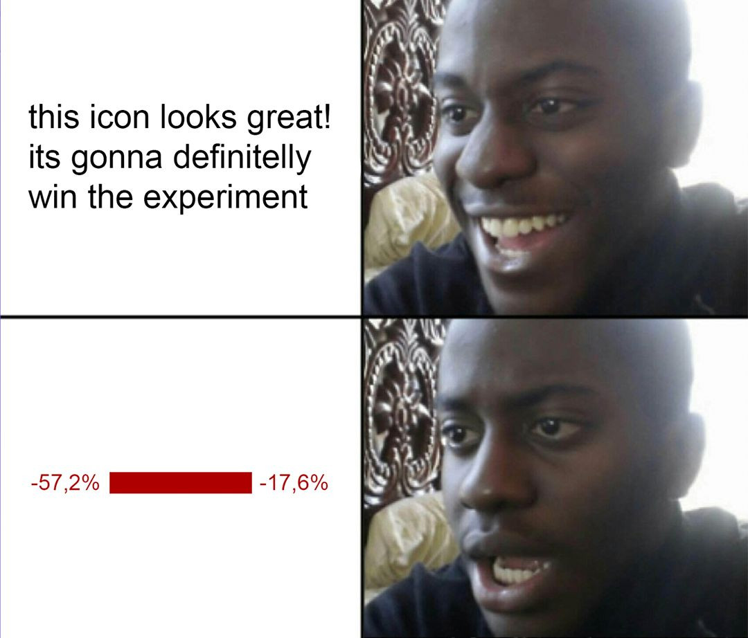
Always test different versions of your app icon to find out which one performs best. Platforms like Google Play Experiments allow you to run A/B tests to identify which icon leads to higher conversion rates. You can test different color schemes, shapes, or focal points.
Use colors that contrast well with typical app store backgrounds. A strong contrast ensures that your icon pops off the screen, making it more noticeable. Bright and bold colors can help, but they should still align with your game’s branding.
Example of Success:
![]()
Games like Clash Royale have mastered the art of designing highly recognizable and genre-appropriate icons. The game’s icon features bold colors, a familiar character, and a clear visual style, making it easy to identify and appealing to its target audience.
Screenshots: Showcasing Your Game’s Best Features
After your app icon catches the user’s eye, screenshots serve as the next step in convincing them to download your game. Well-optimized screenshots should highlight the most engaging aspects of your game while remaining clear and visually appealing.
Best Practices for Game Screenshots
Focus on moments that highlight unique gameplay mechanics, impressive graphics, or high-action sequences. These moments help users imagine what it will feel like to play your game.
Adding short, punchy text overlays to your screenshots can emphasize key features or gameplay benefits, such as “Unlock Unique Characters” or “Epic Multiplayer Battles.” Make sure the text is clear and doesn’t clutter the image.
Tell a story with your screenshots. Arrange them in a way that mimics the user experience, starting with an overview and moving to more specific features. A logical flow can help users understand the game's core mechanics and value.
Just like icons, screenshots benefit greatly from A/B testing. Test different themes, feature highlights, or the order in which they’re presented. For example, test whether users respond better to action-packed screenshots or those highlighting strategic gameplay.
Make sure your screenshots are optimized for both portrait and landscape modes, depending on your game’s orientation. Users need to see what the actual gameplay experience will be like, and mismatched screenshots can lead to lower conversions.
Example of Success:
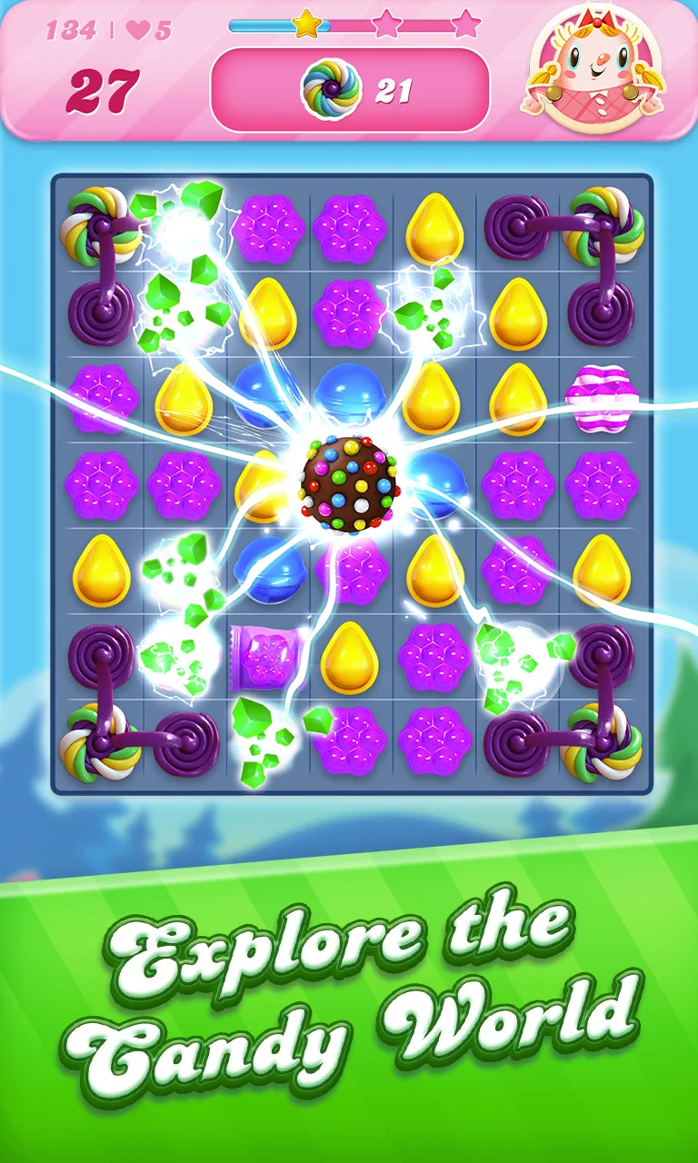
Candy Crush Saga uses vibrant, colorful screenshots that immediately showcase its easy-to-understand gameplay and appealing design. They keep text to a minimum, letting the visuals do most of the talking, which resonates well with their casual gaming audience.
App Store Videos: The Ultimate Engagement Tool
App store videos are a powerful for capturing the attention of potential players. They offer a dynamic way to show users what makes your game exciting, and they can significantly increase your conversion rate when done well.
Video Optimization Tips
Users have short attention spans, so make sure your video is engaging within the first few seconds. The ideal video length for app store videos is between 15-30 seconds. Start with a strong hook, such as a thrilling action sequence or an impressive visual effect.
Focus on the core gameplay elements that differentiate your game. Avoid overly cinematic sequences that don’t accurately represent the user experience. Players want to see what they’ll actually be doing in the game.
A well-placed call-to-action at the end of your video can increase the likelihood of conversions. It could be something simple like “Download Now” or “Join the Battle.”
Since app store videos often autoplay without sound, it’s crucial to use text overlays or captions to explain key moments or features. This ensures that your message comes across even if the user is browsing silently.
Don’t forget the video thumbnail! This is the first frame users will see before clicking to watch. Make sure it’s an eye-catching image that represents the game’s excitement and action. Many developers treat this thumbnail like an additional screenshot.
Example of Success:
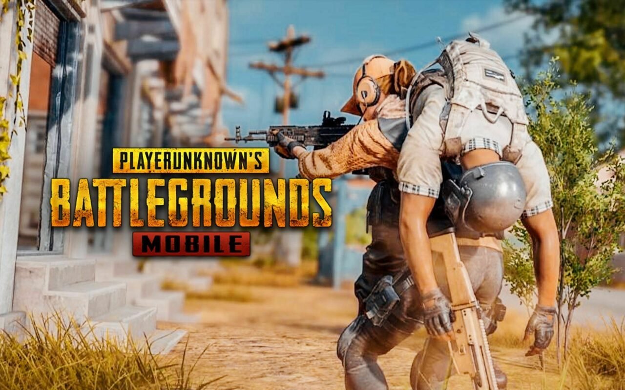
PUBG Mobile uses action-packed, high-intensity videos that showcase core gameplay mechanics, from firefights to survival strategies. The latest video featuring game event "Bloodmoon Awakening" is fast-paced and gives users a quick but thorough glimpse into what makes the game exciting.
Conclusion: The Power of Visual Optimization
Creative optimization is an essential part of any ASO strategy, especially for mobile games. Your app’s icon, screenshots, and video are the main factors that drive conversions, and optimizing these assets can make the difference between a user scrolling past your game or hitting “Install.”
By focusing on simplicity, clarity, and relevance for your target audience, while constantly testing different creative approaches, you can significantly boost both your app’s visibility and conversion rate. Remember, the goal of creative optimization is not just to stand out but to provide users with a visual experience that reflects the core enjoyment and engagement of your game.
For sustained ASO success, make sure you revisit and refresh your visuals regularly to stay relevant and engaging in a highly competitive and ever-evolving app store environment.

